Responsive Web design is the approach that suggests that design and development should respond to the user’s behavior and environment based on screen size, platform and orientation. The practice consists of a mix of flexible grids and layouts, images and an intelligent use of CSS media queries. As the user switches from their laptop to iPad, the website should automatically switch to accommodate for resolution, image size and scripting abilities. In other words, the website should have the technology to automatically respond to the user’s preferences. This would eliminate the need for a different design and development phase for each new gadget on the market.
The Concept Of Responsive Web Design
It’s hard to talk about responsive design without mentioning its creator, Ethan Marcotte. If you haven’t read his seminal article about responsive web design, I highly recommend you check it out (seriously, this is required reading). In the article, Ethan discusses all the key ideas that form responsive web design; and that’s really what responsive design is, technically. It’s not a single piece of technology, but rather, a set of techniques and ideas that form a whole. This is one of the main sources of confusion, and in a moment we’ll break things down and take a look at each part.
So, what is responsive design exactly? Actually, a better question to ask might be, what problem does responsive web design solve? Well, as you may have noticed, computers aren’t the only piece of hardware with a web browser anymore. I might get myself in trouble by saying this, but the iPhone was one of the first mobile devices to feature a really great web browser, and it really put the spotlight on upgrading the experience of the mobile web. Many other devices followed suit and, seemingly overnight, the face of the mobile web had changed.
The changing landscape of web browsers meant that users expectations also changed; people expected to be able to browse the web on their phones just as easily as they browse the web on a desktop computer. So, in response to this (if you’ll excuse the pun) the web design community started creating mobile versions of their websites. In hindsight, this wasn’t really the way forward, but at the time it seemed like a reasonable idea. Every website would have their normal ‘desktop’ version of their site, and as a bonus, a ‘mobile’ version.
Technology never stops marching forward, so not long after the phone hardware market had been revolutionized, other form factors surged in popularity. In addition to phones and personal computers, devices like touchscreen tablets and small notebook computers (netbooks, if you prefer the term) started appearing everywhere.
It’s not just small screens, either. Large, high-resolution displays are starting to become much more common than they used to be, and it would be a waste for web designers to not take advantage of this.
In summary, the spectrum of screen sizes and resolutions is widening every day, and creating a different version of a website that targets each individual device is not a practical way forward. This is the problem that responsive web design addresses head on.
Previously, I mentioned that responsive web design is not a single piece of technology, but rather, a collection of techniques and ideas. Now that we have a better idea of the problem space we’re addressing, let’s take a look at each part of the solution.
Adjusting Screen Resolution
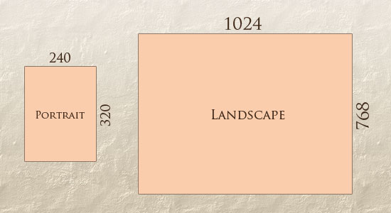
With more devices come varying screen resolutions, definitions and orientations. New devices with new screen sizes are being developed every day, and each of these devices may be able to handle variations in size, functionality and even color. Some are in landscape, others in portrait, still others even completely square. As we know from the rising popularity of the iPhone, iPad and advanced smartphones, many new devices are able to switch from portrait to landscape at the user’s whim. How is one to design for these situations?
In addition to designing for both landscape and portrait (and enabling those orientations to possibly switch in an instant upon page load), we must consider the hundreds of different screen sizes. Yes, it is possible to group them into major categories, design for each of them, and make each design as flexible as necessary. But that can be overwhelming, and who knows what the usage figures will be in five years? Besides, many users do not maximize their browsers, which itself leaves far too much room for variety among screen sizes

Fluid Grids
The first key idea behind responsive design is the usage of what’s known as a fluid grid. In recent memory, creating a ‘liquid layout’ that expands with the page hasn’t been quite as popular as creating fixed width layouts; page designs that are a fixed number of pixels across, and then centered on the page. However, when one considers the huge number of screen resolutions present in today’s market, the benefit of liquid layouts is too great to ignore.
Fluid grids go a few steps beyond the traditional liquid layout. Instead of designing a layout based on rigid pixels or arbitrary percentage values, a fluid grid is more carefully designed in terms of proportions. This way, when a layout is squeezed onto a tiny mobile device or stretched across a huge screen, all of the elements in the layout will resize their widths in relation to one another.
In order to calculate the proportions for each page element, you must divide the target element by its context. Currently, the best way to do this is to first create a high fidelity mockup in a pixel based imaged editor, like Photoshop. With your high fidelity mockup in hand, you can measure a page element and divide it by the full width of the page. For example, if your layout is a typical size like 960 pixels across, then this would be your “container” value. Then, let’s say that our target element is some arbitrary value, like 300 pixels wide. If we multiply the result by 100, we get the percentage value of 31.25% which we can apply to the target element. Here’s the math:

If your values don’t work out so neatly, and you get some floating point value with many numbers after the decimal, don’t round the value! We humans may enjoy nice neat numbers and making our code look pretty, but your computer (and the final look of your design) will benefit from the seemingly excessive mathematical precision.
Fluid grids are a very important part of creating a responsive design, but they can only take us so far. When the width of the browser becomes too narrow, the design can start to severely break down. For example, a complex three-column layout isn’t going to work very well on a small mobile phone. Fortunately, responsive design has taken care of this problem by using media queries.
Flexible Images
One major problem that needs to be solved with responsive Web design is working with images. There are a number of techniques to resize images proportionately, and many are easily done. The most popular option, noted in Ethan Marcotte’s article on fluid images but first experimented with by Richard Rutter, is to use CSS’s max-width for an easy fix.
img { max-width: 100%; }As long as no other width-based image styles override this rule, every image will load in its original size, unless the viewing area becomes narrower than the image’s original width. The maximum width of the image is set to 100% of the screen or browser width, so when that 100% becomes narrower, so does the image. Essentially, as Jason Grigsby noted, “The idea behind fluid images is that you deliver images at the maximum size they will be used at. You don’t declare the height and width in your code, but instead let the browser resize the images as needed while using CSS to guide their relative size”. It’s a great and simple technique to resize images beautifully.
Note that max-width is not supported in IE, but a good use of width: 100% would solve the problem neatly in an IE-specific style sheet. One more issue is that when an image is resized too small in some older browsers in Windows, the rendering isn’t as clear as it ought to be. There is a JavaScript to fix this issue, though, found in Ethan Marcotte’s article.
While the above is a great quick fix and good start to responsive images, image resolution and download times should be the primary considerations. While resizing an image for mobile devices can be very simple, if the original image size is meant for large devices, it could significantly slow download times and take up space unnecessarily

Custom Layout Structure
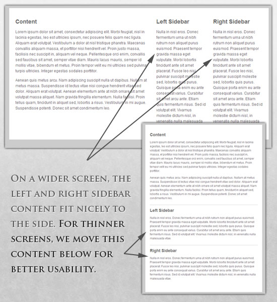
For extreme size changes, we may want to change the layout altogether, either through a separate style sheet or, more efficiently, through a CSS media query. This does not have to be troublesome; most of the styles can remain the same, while specific style sheets can inherit these styles and move elements around with floats, widths, heights and so on.
For example, we could have one main style sheet (which would also be the default) that would define all of the main structural elements, such as #wrapper,#content, #sidebar, #nav, along with colors, backgrounds and typography. Default flexible widths and floats could also be defined.
If a style sheet made the layout too narrow, short, wide or tall, we could then detect that and switch to a new style sheet. This new child style sheet would adopt everything from the default style sheet and then just redefine the layout’s structure.
MEDIA QUERIES
CSS3 supports all of the same media types as CSS 2.1, such as screen, printand handheld, but has added dozens of new media features, including max-width, device-width, orientation and color. New devices made after the release of CSS3 (such as the iPad and Android devices) will definitely support media features. So, calling a media query using CSS3 features to target these devices would work just fine, and it will be ignored if accessed by an older computer browser that does not support CSS3.
In Ethan Marcotte’s article, we see an example of a media query in action:
<link rel="stylesheet" type="text/css"
	media="screen and (max-device-width: 480px)"
	href="shetland.css" />
This media query is fairly self-explanatory: if the browser displays this page on a screen (rather than print, etc.), and if the width of the screen (not necessarily the viewport) is 480 pixels or less, then load shetland.css.
New CSS3 features also include orientation (portrait vs. landscape), device-width, min-device-width and more. Look at “The Orientation Media Query” for more information on setting and restricting widths based on these media query features.
One can create multiple style sheets, as well as basic layout alterations defined to fit ranges of widths — even for landscape vs. portrait orientations. Be sure to look at the section of Ethan Marcotte’s article entitled “Meet the media query” for more examples and a more thorough explanation.
Multiple media queries can also be dropped right into a single style sheet, which is the most efficient option when used:
/* Smartphones (portrait and landscape) ----------- */
@media only screen
and (min-device-width : 320px)
and (max-device-width : 480px) {
/* Styles */
}

/* Smartphones (landscape) ----------- */
@media only screen
and (min-width : 321px) {
/* Styles */
}

/* Smartphones (portrait) ----------- */
@media only screen
and (max-width : 320px) {
/* Styles */
}
The code above is from a free template for multiple media queries between popular devices by Andy Clark. See the differences between this approach and including different style sheet files in the mark-up as shown in the post “Hardboiled CSS3 Media Queries.”
CSS3 MEDIA QUERIES
Above are a few examples of how media queries, both from CSS 2.1 and CSS3 could work. Let’s now look at some specific how-to’s for using CSS3 media queries to create responsive Web designs. Many of these uses are relevant today, and all will definitely be usable in the near future.
The min-width and max-width properties do exactly what they suggest. Themin-width property sets a minimum browser or screen width that a certain set of styles (or separate style sheet) would apply to. If anything is below this limit, the style sheet link or styles will be ignored. The max-width property does just the opposite. Anything above the maximum browser or screen width specified would not apply to the respective media query.
Note in the examples below that we’re using the syntax for media queries that could be used all in one style sheet. As mentioned above, the most efficient way to use media queries is to place them all in one CSS style sheet, with the rest of the styles for the website. This way, multiple requests don’t have to be made for multiple style sheets.
@media screen and (min-width: 600px) {
     .hereIsMyClass {
          width: 30%;
          float: right;
     }
}
The class specified in the media query above (hereIsMyClass) will work only if the browser or screen width is above 600 pixels. In other words, this media query will run only if the minimum width is 600 pixels (therefore, 600 pixels or wider).
@media screen and (max-width: 600px) {
     .aClassforSmallScreens {
          clear: both;
		  font-size: 1.3em;
     }
}
Now, with the use of max-width, this media query will apply only to browser or screen widths with a maximum width of 600 pixels or narrower.
While the above min-width and max-width can apply to either screen size or browser width, sometimes we’d like a media query that is relevant to device width specifically. This means that even if a browser or other viewing area is minimized to something smaller, the media query would still apply to the size of the actual device. The min-device-width and max-device-width media query properties are great for targeting certain devices with set dimensions, without applying the same styles to other screen sizes in a browser that mimics the device’s size.
@media screen and (max-device-width: 480px) { .classForiPhoneDisplay { font-size: 1.2em; } }@media screen and (min-device-width: 768px) { .minimumiPadWidth { clear: both; margin-bottom: 2px solid #ccc; } }
There are also other tricks with media queries to target specific devices. Thomas Maier has written two short snippets and explanations for targeting the iPhone and iPad only:
For the iPad specifically, there is also a media query property called orientation. The value can be either landscape (horizontal orientation) or portrait (vertical orientation).
@media screen and (orientation: landscape) { .iPadLandscape { width: 30%; float: right; } }@media screen and (orientation: portrait) { .iPadPortrait { clear: both; } }
Unfortunately, this property works only on the iPad. When determining the orientation for the iPhone and other devices, the use of max-device-width andmin-device-width should do the trick.
There are also many media queries that make sense when combined. For example, the min-width and max-width media queries are combined all the time to set a style specific to a certain range.
@media screen and (min-width: 800px) and (max-width: 1200px) {
     .classForaMediumScreen {
          background: #cc0000;
          width: 30%;
          float: right;
     }
}
The above code in this media query applies only to screen and browser widths between 800 and 1200 pixels. A good use of this technique is to show certain content or entire sidebars in a layout depending on how much horizontal space is available.
Some designers would also prefer to link to a separate style sheet for certain media queries, which is perfectly fine if the organizational benefits outweigh the efficiency lost. For devices that do not switch orientation or for screens whose browser width cannot be changed manually, using a separate style sheet should be fine.
You might want, for example, to place media queries all in one style sheet (as above) for devices like the iPad. Because such a device can switch from portrait to landscape in an instant, if these two media queries were placed in separate style sheets, the website would have to call each style sheet file every time the user switched orientations. Placing a media query for both the horizontal and vertical orientations of the iPad in the same style sheet file would be far more efficient.
Another example is a flexible design meant for a standard computer screen with a resizable browser. If the browser can be manually resized, placing all variable media queries in one style sheet would be best.
Nevertheless, organization can be key, and a designer may wish to define media queries in a standard HTML link tag:
<link rel="stylesheet" media="screen and (max-width: 600px)" href="small.css" />
<link rel="stylesheet" media="screen and (min-width: 600px)" href="large.css" />
<link rel="stylesheet" media="print" href="print.css" />
JAVASCRIPT
Another method that can be used is JavaScript, especially as a back-up to devices that don’t support all of the CSS3 media query options. Fortunately, there is already a pre-made JavaScript library that makes older browsers (IE 5+, Firefox 1+, Safari 2) support CSS3 media queries. If you’re already using these queries, just grab a copy of the library, and include it in the mark-up: css3-mediaqueries.js.
In addition, below is a sample jQuery snippet that detects browser width and changes the style sheet accordingly — if one prefers a more hands-on approach:
<script type="text/javascript" src="http://ajax.googleapis.com/ajax/libs/jquery/1.4.4/jquery.min.js"></script>

<script type="text/javascript">
	$(document).ready(function(){
		$(window).bind("resize", resizeWindow);
		function resizeWindow(e){
			var newWindowWidth = $(window).width();			// If width width is below 600px, switch to the mobile stylesheet
			if(newWindowWidth < 600){ 				$("link[rel=stylesheet]").attr({href : "mobile.css"});	 			} 			// Else if width is above 600px, switch to the large stylesheet 			else if(newWindowWidth > 600){
				$("link[rel=stylesheet]").attr({href : "style.css"});
			}
		}
	});
</script>
There are many solutions for pairing up JavaScript with CSS media queries. Remember that media queries are not an absolute answer, but rather are fantastic options for responsive Web design when it comes to pure CSS-based solutions. With the addition of JavaScript, we can accomodate far more variations. For detailed information on using JavaScript to mimic or work with media queries, look at “Combining Media Queries and JavaScript.”
Conclusion
We are indeed entering a new age of Web design and development. Far too many options are available now, and there will be far too many in the future to continue adjusting and creating custom solutions for each screen size, device and advancement in technology. We should rather start a new era today: creating websites that are future-ready right now. Understanding how to make a design responsive to the user doesn’t require too much learning, and it can definitely be a lot less stressful and more productive than learning how to design and code properly for every single device available.
Responsive Web design and the techniques discussed above are not the final answer to the ever-changing mobile world. Responsive Web design is a mere concept that when implemented correctly can improve the user experience, but not completely solve it for every user, device and platform. We will need to constantly work with new devices, resolutions and technologies to continually improve the user experience as technology evolves in the coming years.
Besides saving us from frustration, responsive Web design is also best for the user. Every custom solution makes for a better user experience. With responsive Web design, we can create custom solutions for a wider range of users, on a wider range of devices. A website can be tailored as well for someone on an old laptop or device as it can for the vast majority of people on the trendiest gadgets around, and likewise as much for the few users who own the most advanced gadgets now and in the years to come. Responsive Web design creates a great custom experience for everyone. As Web designers, we all strive for that every day on every project anyway, right?
Resources
- Responsive Web Design Video Course on Treehouse
- Video: Introduction to Responsive Web Design
- Ethan Marcotte’s article on Responsive Web Design
- The W3C specification for CSS3 Media Queries
- A great roundup of responsive design techniques via Smashing Magazine
Hopefully this article helped, but if you’re still feeling confused about responsive design, don’t be afraid to leave a question or comment. If you’re already utilizing responsive web design in your site or web application, share the link here so we can see!


 Hacks
Hacks 